Should Marketers Use Pop-Up Forms? A Comprehensive Analysis
As inbound marketers, we care about creating lovable experiences for our website visitors — but we also want to generate as many leads as we can for our sales teams. Most of the time we can do both without any problem. But when it comes to pop-up forms, conflict does emerge.
Pop-ups are everywhere these days. Over the past few years, pop-up forms have re-emerged as a popular marketing tactic for promoting content, driving blog subscriptions, growing email lists, and fueling lead generation.
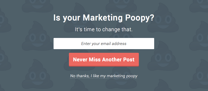
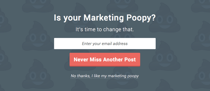
Some pop-ups are fairly benign and you hardly notice them. Others are distracting, and quite frankly, downright poopy (see the example below).
Pop-ups have become so prevalent that even Google has had to weigh in, announcing that they will begin to penalize websites that use what they call “intrusive interstitials” (we call them “crappy popups”).
So the million dollar question for inbound marketers is this: Should we be using pop-up forms? Before we dive in and attempt to answer this question, let’s take a step back and re-acclimate ourselves with the world of pop-ups.
What Is a Pop-Up Form?
According to Wikipedia, the first ever pop-up ad appeared in the late 1990s on the web hosting website Tripod.com. In their early days, pop-ups were primarily used by third-party advertisers, and they were particularly cringe-worthy. Do you remember the first time a brightly colored pop-up jumped out on your screen, alerting you that you’d won some sort of content or prize? I know I do. And as far as I can remember, I never collected any of those fabulous prizes.
Over time, consumers and web browsers alike got better at hiding or ignoring these types of pop-ups, and eventually, advertisers gave up. Nowadays you’ll rarely see a sketchy third-party pop-up — unless you find yourself on a particularly sketchy website.
For a time, pop-up ads largely disappeared from the internet. But they eventually became replaced by pop-up forms. Only this time it wasn’t third-party advertisers that were using this pop-up format … it was marketers like you and me.
Because of the association of intrusive ads with this pop-up functionality, marketers need to be careful of when and how they appear as well as the type of content they present.
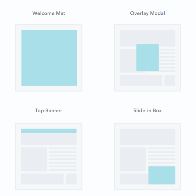
Pop-ups come in many shapes and sizes, but here’s a graphic that depicts the most common ones you might see on a web page:
Let’s dive a little deeper into these pop-up formats:
1. Welcome Mats
These are full-screen pop-ups that slide above the page content. The up-side to these is that they bring the offer front and center in front of website visitors. You may consider doing this if the offer is highly relevant to your content and important to your strategy. Otherwise, a welcome mat pop-up may be a little too intrusive and annoying for your users.
2. Overlay Modals
As close to the traditional pop-up as you can get, these are center screen pop-ups that appear on top of page content. Unlike the welcome mat, overlays don’t block the rest of the content from being shown, but the user will have to click out of the pop-up to continue what they’re doing. While some users do feel that overlay modals are intrusive, they often have high conversion rates if the offer is compelling.
3. On-Click Pop-Ups
An on-click pop-up is a specific type of overlay modal that pops up with a form when a user clicks a call-to-action or other page element. They’re perfect for when an in-line form would clutter the page but you want to decrease friction to a particular offer. The UX tends to be easy, which reduces friction on the conversion path.
4. Gamified Coupons
Another type of overlay modal, gamified coupons will let you play a game for a discount or prize of some kind in exchange for the users information. They often come in the form of a prize wheel or scratch-off ticket and are best for fun ecommerce store brands (since the coupon can then be applied at checkout).
5. Top Banners (Also Called Sticky Bars)
These are small banners that manifest as a bar at the very top of the page, asking the user to take action on something. They are typically a more permanent conversion element than other types of pop-up and are best used for broad offers such as newsletter subscriptions, coupons, or even general announcements.
6. Slide-In Boxes
Slide-ins are small boxes that slide in from the side/bottom of the page, similar to an overlay modal but with less obtrusive behavior. These are great for presenting offers as the user is scrolling through the content of the page.
Pop-Up Triggers
As more and more marketers have started using pop-up forms, a mini-industry of pop-up providers has emerged, offering bells and whistles that were never available before. Most notably, pop-up tools have proliferated the types of triggers that prompt a pop-up to appear.
Among the most popular pop-up triggers are:
- Page entrance: Pop-up appears when the visitor first gets to the page. These are often considered the most annoying and but can be used effectively with the less-intrusive formats such as the top banner.
- Page scroll: Pop-up appears when the visitor scrolls to a certain point on the page. These are great for long-form content when you don’t want to embed CTAs in the content.
- Element interaction: Pop-up appears when the visitor clicks on or hovers over a specific element. These are highly effective since the user took a specific action with intent to convert.
- Time on page: Pop-up appears when the visitor has been on the page for a specific amount of time.
- Exit intent: Exit intent pop-ups appear when the visitor scrolls towards the top of the page to leave. Consider it a last-ditch effort to capture their attention before they leave.
- Inactivity: Pop-up appears when the user has not taken action on the website in a while.
Now that we know a little more about pop-up forms, let’s get back to the core question: Should marketers be using them?
And in order to properly answer that question, we need to consider two slightly more specific but related questions:
- Do they work?
- Is it possible create inboundy pop-up forms that don’t, well, suck?
Let’s dig in.
Do Pop-Up Forms Work?
I’ll answer this one right off the bat: The answer is yes. Pop-up forms do work, and this is the main reason so many marketers are using them.
According to research conducted by Sumo, the top performing 10% of pop-up forms convert at a whopping 9.3%. Now I don’t know about you, but an additional 9.3% conversion rate across my website sounds pretty good to me.

Source: AWeber
The numbers don’t lie: Pop-up forms work. However, is that worth sacrificing the experience that a visitor has on your site? The inbound answer is no. User experience trumps all else.
But what if you didn’t have to sacrifice performance for experience? What if you could create user-friendly pop-ups that didn’t suck?
Is There Such a Thing as an Inbound Pop-Up?
If you ask someone how they feel about pop-ups, they’re likely to offer an emotional response that loosely resembles a child eating vegetables (I call this expression “blegh”).
People hate the idea of pop-ups. Most pop-ups out there are annoying. What’s more, the pop-ups that annoy you the most are the ones you’ll remember the longest.
But here’s the thing: not all pop-ups are bad. Pop-ups can be used for good, and they can be a healthy part of an inbound strategy.
Just think about email marketing for a second. Email is another example of a channel that has been heavily abused. We’ve all gotten some crappy emails throughout the years. But as inbound marketers, we know to use email responsibly and to only send contextualized email that adds value to people’s lives.
The same goes for pop-ups. When used correctly, they can actually enhance the experience a user has on your website, as well as boost your conversion rates.
4 Tips for Crafting High-Converting Pop-ups (That Don’t Suck)
But how do we make sure that our pop-ups are helpful and not spammy? Here are some guidelines.
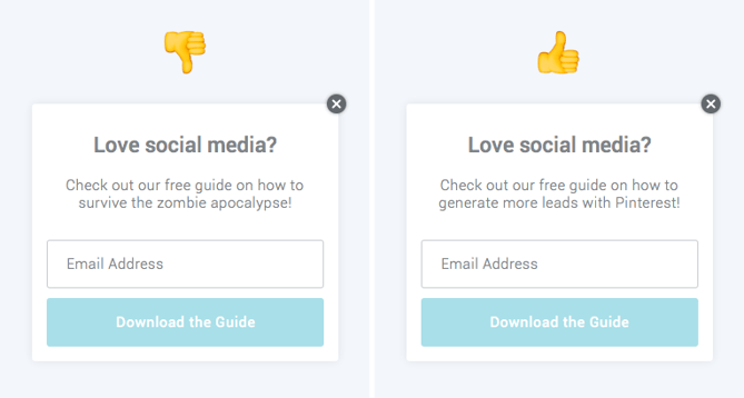
1. Offer something relevant and valuable.
The problem with most pop-ups is they get in the way of the visitor’s experience on a website, rather than enhance it. Oftentimes this is because what’s being offered in the pop-up is either not valuable to the visitor, or it has nothing to do with the page they’re on.
To boost engagement with your pop-up as well as enhance the experience that someone has on your site, be sure to offer something that is both valuable and relevant to them, given the page that they’re on. For example, if I were writing a blog post on social media, I would offer a free ebook on the same topic:
2. Think about the way people engage with your pages.
Another common mistake marketers make with pop-ups is having them appear at the wrong time, which adds to the annoyance factor. Be strategic about the timing and trigger of your pop-ups. Think about the way that visitors interact with certain types of pages on your site.
For instance, when someone engages with a blog post, they do so by scrolling down the page as they read the content. If you want to catch your visitors while they’re most engaged, then you should customize your pop-up to appear when someone has scrolled halfway down the page.
Similarly, you might find that people who stay on your product or pricing pages for more than 30 seconds are highly engaged because they’re taking the time to read through and consider their options. In this scenario, you could use a time-based pop-up that appears when a visitor has been on the page for a specific number of seconds.
To better understand exactly how your visitors engage with different pages on your site, try looking into Google Analytics data, such as bounce rate and average time on page. Better yet, use a tool like HotJar or Crazy Egg to record users on your site to build heat maps of where they click and scroll. This will give you a better sense of how people engage with your content.
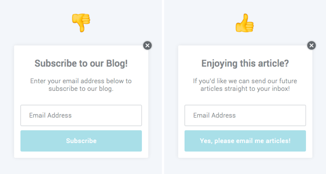
3. Use language that’s specific, actionable, and human.
Most pop-up forms have a fairly basic layout. You get a headline, some body copy, and maybe an image. In other words, you don’t have a lot of real estate to work with.
This means it’s super important to nail the copy on your pop-up form. In order to do that make sure your copy is specific, actionable, and human:
- Specific: Specify exactly what a visitor is going to get if they click on your pop-up. Don’t tell them it’s a guide; tell them it’s a 10-page guide with actionable tips. Don’t encourage them to join your email list; ask if they’d be okay with getting two to three emails on a given topic per week.
- Actionable: Let visitors know exactly what you’d like them to do. Instead of “Click Here,” try “Download our Free Guide,” or better yet, “Get my Free Guide.” Craft a compelling call-to-action that will inspire your visitors to take action.
- Human: Remind visitors that there’s a real person behind the pop-up form. Use colloquial language to make your forms friendly. Instead of “Join our email list,” try “Mind if we email you twice a week?” Instead of “Subscribe to our blog,” try “We’d be happy to notify you whenever we publish new articles.”
4. Don’t ruin the mobile experience.
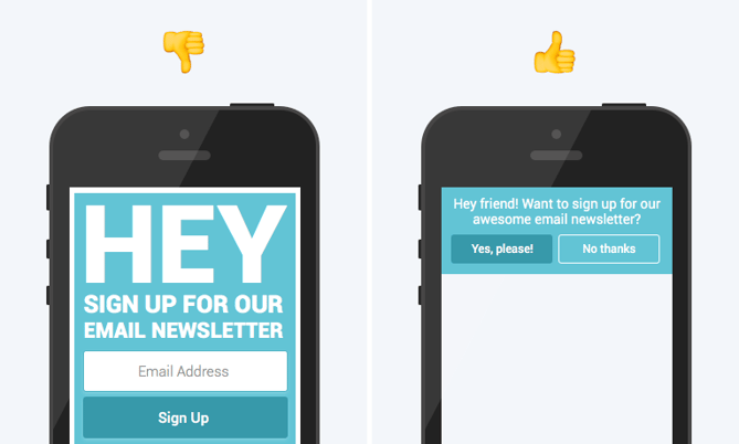
In an effort to improve mobile user experience, Google announced that they were going to start penalizing websites that use what they call “obtrusive interstitials” — in other words, pop-ups that mess with the user experience. Now I don’t know about you, but I certainly don’t want my Google rankings to go down from using pop-up forms.
To ensure a user-friendly mobile experience and avoid being penalized by Google, be sure exclude your pop-up forms for mobile, or use pop-ups that don’t take up the entire screen of the page on mobile devices. Most pop-up tools already offer this type of functionality, but if what you’re currently using doesn’t, you may need to find a new solution.
Need a Free Pop-Up Tool?
So there you have it. To sum up: Pop-up forms do work, they can be inboundy, and you should be using them.
If you’re looking to get started with pop-up forms, we’d recommend that you try HubSpot’s free marketing tools. We built it ourselves to help marketers generate more leads across their entire website without sacrificing the user experience.
Editor’s note: This post was originally published in October 2016 and has been updated for comprehensiveness.
![]()
As inbound marketers, we care about creating lovable experiences for our website visitors — but we also want to generate as many leads as we can for our sales teams. Most of the time we can do both without any problem. But when it comes to pop-up forms, conflict does emerge.


