17 of the Most Creative ‘Meet the Team’ Pages We’ve Ever Seen
To a prospect seeking out a new service provider, it can all be a little overwhelming. It’s easy to wonder: Who are the real people behind all the smoke and mirrors?
Adding a “Meet the Team” page or section to your website is an easy, effective way to give your business a accessible face. It gives prospects an idea of who exactly they’ll be working with, and shows potential employees that you’re proud of the people on your team.
For some inspiration, see how these companies introduce visitors to their most important creative assets: their people.
1. Yokel Local
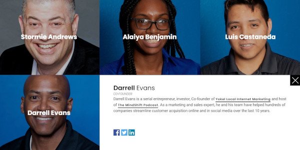
Yokel Local is a Platinum HubSpot Agency Partner who positions themselves as an extension of their clients’ marketing teams. For that reason, they showcase the people on their staff to highlight the humans behind the brand.
What’s pleasing about this particular ‘meet the team’ page is the matching blue backgrounds and cool palette. The grid design provides a modern feel, and if you click on one of the faces, a box will open with more information about the team member, including their bio, credentials, and social profiles.

2. Digital Marmelade
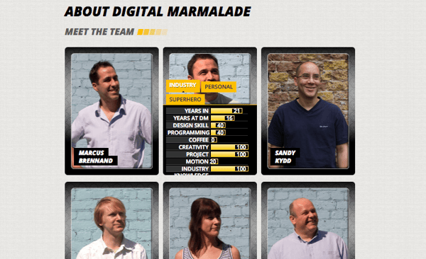
Since most employee bios read a lot like a list of stats (“10 years in the industry … 4 years at the company … Managed 80 website redesign projects … “) the folks at Digital Marmelade decided to have a little fun with the format.
Each employee at the London-based marketing agency has a trading card-style profile detailing their actual marketing accomplishments and personal facts, as well as their fictional superhero abilities.
It’s a quirky twist that gives visitors a colorful snapshot of the agency’s team, highlighting both their impressive experience and friendly culture.
3. CloudHorizon
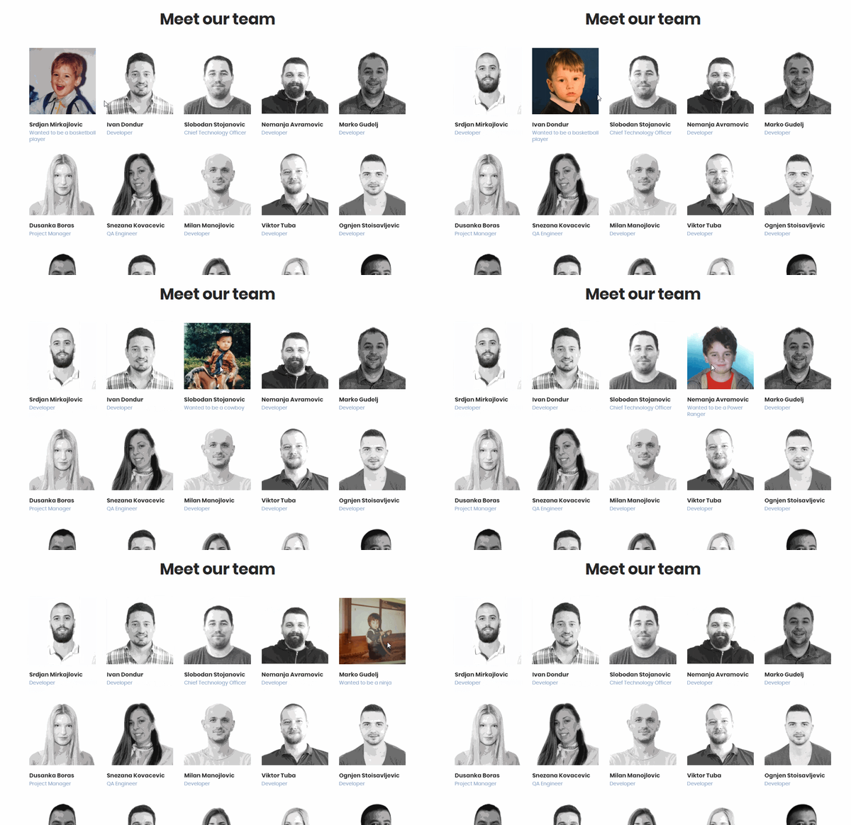
CloudHorizon is a mobile product development company. On their about page, they say, “Some of the more rewarding projects we have had the honour to be involved in, started with simple ideas and grew profitable businesses from the ground up.”
With this in mind, their ‘meet our team’ section is a great way to illustrate that idea. When you hover over an image of a team member, their thumbnail flips over to reveal a photo from their childhood with a small caption of what they wanted to be when they grew up. The idea being that it takes time and innovation to become great things.
4. Bolden
Bolden’s team bios are more conventional than some of the others on this list, but what they lack in invention they more than make up for with style.
Hovering over each team member’s picture produces a colorful stacked card effect, revealing brief employee bios in coordinated fonts. This is a great example of a minimal, accessible “Meet the Team” page that manages to look cool and introduce the faces behind the agency without going over the top.

5. Rock Kitchen Harris
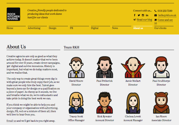
Rock Kitchen Harris, a full-service agency, decided to skip the photos altogether and showcase the cartoon versions of their employees instead.
Each employee at the English agency had a custom caricature drawn up, and every single one has a different personality. While some employees opted for representations reminiscent of LinkedIn profile pictures, others got a little creative with it, dressing their cartoon selves up as Ewoks and other characters.
6. FCINQ
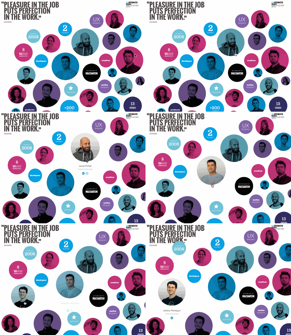
FCINQ, a creative studio, introduces us to their team with a collage of colorful bubbles.
Hovering over an employee’s individual circle produces a zoomed-in effect, and clicking expands their headshot with their name and social profiles. The splashy set up is a stylish alternative to the expected rows of team photos and names.
7. Zulu Alpha Kilo
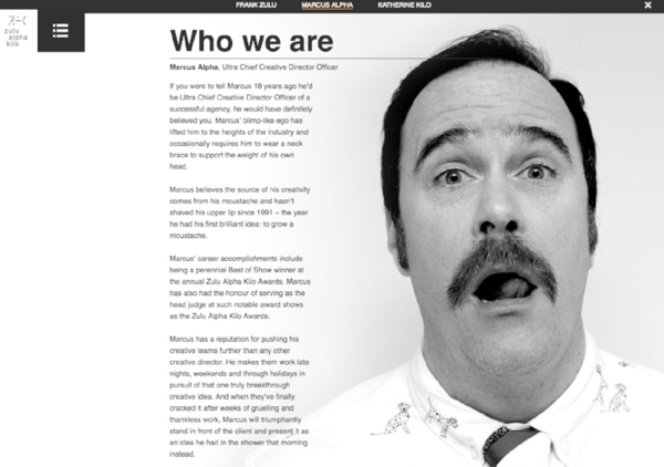
This Canadian agency presents their founding team with refreshing comedic flair. While many agency leaders choose to represent themselves with stoic business portraits, the three leaders of Zulu Alpha Kilo opted for playful photos and cheeky bios.
Here’s an excerpt from the bio of Marcus Alpha — the agency’s “Ultra Chief Creative Director Officer”:
Marcus has a reputation for pushing his creative teams further than any other creative director. He makes them work late nights, weekends and through holidays in pursuit of that one truly breakthrough creative idea. And when they’ve finally cracked it after weeks of gruelling and thankless work, Marcus will triumphantly stand in front of the client and present it as an idea he had in the shower that morning instead.
8. Stink Digital
We love this expertly color-coordinated slideshow of team members form Stink Digital.
This creative agency has offices in five major cities around the world — including New York, Paris, and Berlin — but having a personable “Meet the Team” section helps give their business an accessible edge. They don’t call themselves “a global company with a local feel” for nothing.
9. Drexler
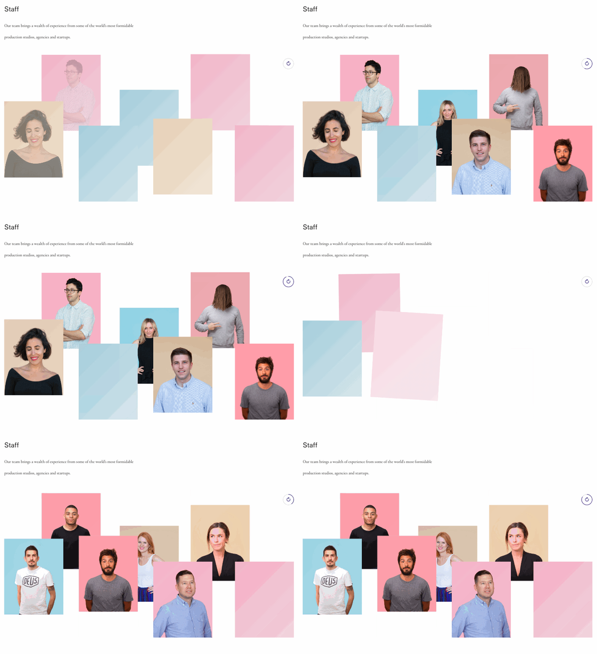
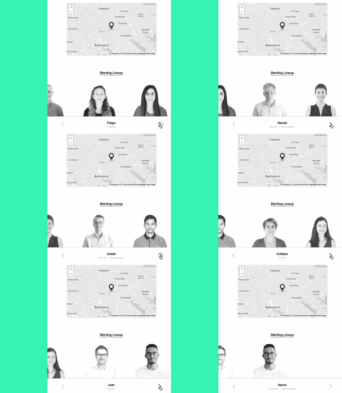
This “Meet the Team” section from Drexler is perfect proof that you don’t necessarily need a whole page devoted to introducing your employees — just a small section can do the trick.
This simple but polished team member marquee appears at the bottom of the Baltimore, Maryland-based agency’s “About” page, and adds a welcome personal touch to their website.
10. Matchstic
As a branding agency, Matchstic knows the importance of identity, creativity, and individuality.
Not only does their ‘who we are’ section on their About page provide that identity by highlighting the human element of their brand, but it also shows their creative side. When you hover over each thumbnail, a goofy illustration is overlaid onto the photo.
In addition, the custom cursor, which only shows up on the About page, is a strong callback to the Matchstic brand, implying a kinetic energy that starts with the lighting of a match.

11. LiveChat
LiveChat, an AI customer service and chatbot solution, approached their “meet the team” page in a completely different way. Instead of just listing out each team member’s roles and experience, they created a photo for each team member that illustrates who they are in a conceptual, fun, and metaphorical way.
This is extremely effective for showcasing the uniqueness of their team, and it compels the website visitor to take the team to look at each picture and read each bio, which results in longer time on page, an important engagement metric.

12. Etsy
Many large companies forgo the “meet the team” page because there are so many team members that it doesn’t make sense to display them all.
At Etsy, though, they acknowledge all the people that make the popular online marketplace possible with a tiled “people board” that scrolls for days.
13. Atlassian
Atlassian, a company behind many of the software solutions used in businesses worldwide, highlights photos of their team on their “people” page, interacting at the office and hard at work.
Below, they showcase their leadership team with colorful headshots that break out of colorful background boxes. When you hover over them, attractive vector graphics appear relating to the individual’s unique role. In addition, a popup appears on click with social icons and a bio. What’s particularly interesting is that there’s also the ability to download their headshot, making the “People” page have extra utility for media professionals.

14. The Correspondent
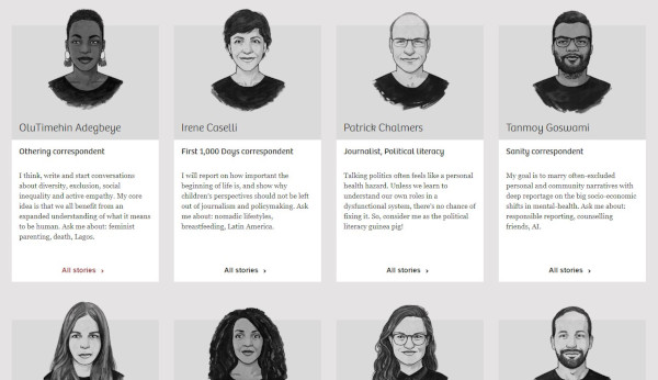
The Correspondent is an organization that offers news without fear-mongering or financial gain. In true journalistic style, the site features each team member in a beautifully rendered cartoon style, providing an artistic feel to the page.
Clicking on each thumbnail leads the website visitor to a place where they can subscribe to that particular writer and view a feed of their pieces. Best of all, the individual’s mission is displayed across the top and contact information in the sidebar.
15. SmartBug Media
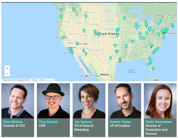
SmartBug is a HubSpot Agency Partner with a distributed team across the U.S. They demonstrate their embrace of remote work by including an interactive map with the locations of all their employees.
You can also browse through their team below, clicking on each headshot to get expanded bios that include 2 fun facts about each team member.
16. Bluleadz
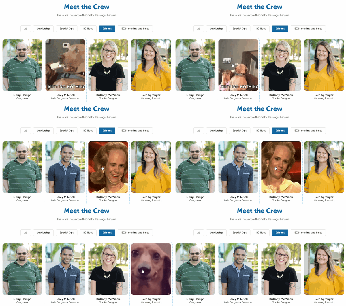
What better way to convey the personality of your team than to display their favorite gifs on mouse hover? That’s what digital marketing agency Bluleadz does. You can almost imagine these folks in the scenarios their gifs represent.
Another unique feature of this “meet the crew” page is the ability to filter Bluleadz employees by function. Each button at the bottom corresponds to a team and brings up the individuals who “make the magic happen” in that area of the business.
17. Media Junction
Bold blocky pops of color? Yes please. HubSpot Elite Agency Partner Media Junction displays their team thumbnails on solid backgrounds with vector shadows. Each photo is a little silly, and many of them bring their furry friends into the picture with them.
In addition, their leadership team’s thumbnails are clickable so that you can read more about them and even send them a message for more information.

“Meet the team” pages resonate because people like to buy from real people, not faceless brands. Best practice is to determine what your brand stands for and create a “meet the team” and About page that conveys that in the strongest possible way.
Editor’s note: This post was originally published in December 2016 and has been updated for comprehensiveness.
![]()
To a prospect seeking out a new service provider, it can all be a little overwhelming. It’s easy to wonder: Who are the real people behind all the smoke and mirrors?


