11 Ad Design Tips to Help Your Brand Cut Through the Noise
Before your copy can persuade an audience to buy your product, your design must persuade them to buy your copy. In advertising, your design catches your audience’s eye and points their attention to your copy. Then, it’s your copy’s job to hold your audience’s attention.
To help grab people’s attention in your advertisements, we’ve put together a list of seven ad tips, supported by examples, that’ll help give you ad design ideas to your brand cut through the noise.
Advertisement Design Tips
Read on to learn how to craft creatively refreshing ads that will convert your audience into customers.
1. Stand out from the crowd.
In a world where countless brands fight for a limited amount of attention, the only way your advertisement can grab people’s attention is by being original.
As a marketer, though, it can be tempting to leap onto the latest trend that all your competitors have already pounced on. If everyone else is implementing the latest tip or trick, it must work, right? To captivate an audience, though, you must resist this urge.
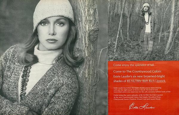
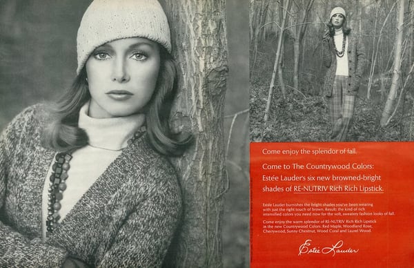
Cliches repel attention. They sap your advertisement’s creativity and can’t activate the prefrontal cortex, which is the part of the brain responsible for experiencing emotions. But how exactly do you create an original advertisement? Consider one of Estée Lauder’s print campaigns from the 1960s.
Back then, Estée Lauder’s main competitors like L’Oréal, Revlon, and Helena Rubinstein all ran vibrant, colorful ads in magazines. Every makeup ad was beautiful and rich. But even though they seemed eye-popping at first glance, audiences became accustomed to these types of ads — they all looked the same. They started blending in with each other.
Realizing that no one could differentiate between the brands running full-color makeup ads flooding magazines during that time period anymore, Estée Lauder did something so controversial it was deemed “radical”, “stupid”, and even “ugly”: they ran their ads in sepia.
Estée Lauder’s print advertising move received its fair share of criticism, but they’re ability to be original helped them immediately stand out from the crowd and rake in 25% more responses than their previous color print campaigns.
2. Focus on benefits and not just features.
A feature is an attribute or aspect of your business that distinguishes it from others in the space. Features are important for consumers as they compare providers and make purchasing decisions. However, in advertising, you are often marketing to a wide audience, many of whom may not be familiar with your organization or know they have need for your goods or services.
For this reason, advertising features can be ineffective and overly salesy. The benefits of a product, on the other hand, can be far more persuasive and impressionable to a wide audience.
Tide exhibits this idea well with their Superbowl commercial.
They could have demonstrated the features of their product by showing a dirty shirt becoming clean again.
Instead, they focus on the advantage: clean and crisp shirts.
They even use a bit of humor while calling out this approach as #NotaTideAd.
3. Use humor.
Speaking of humor, it is an effective tool in advertising because it evokes positive emotion.
The best thing advertising can do is make your solutions memorable. The second best thing it can do is associate that memory with positive emotions.
Zola uses this in their wedding website ad. Weddings are already associated with love and happy times, but Zola differentiates their approach by flipping the script on audience expectation with a silly situation.
Instead of imagining somber heartfelt “I dos,” the couple talks through logistics, which Zola can help with.
4. Convey one message — and one message only.
Sometimes, marketers think the more benefits and features they include in their ads, the higher their conversion rate will be. But trying to read a jumbled ad requires a lot of thought and energy, so cramming an ad with a bricks of copy doesn’t actually grab people’s attention. It repels it.
To immediately hook people and persuade them to read the rest of your ad, consider conveying one message per ad. Spotlighting your product or service’s main benefit or feature will make it easy for your audience to understand its value and increase the likelihood of doing business with you because they’ll leave your ad remembering only one message: your product’s or service’s main feature will benefit their lives somehow, someway.
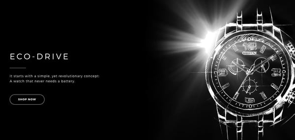
For example, in Citizen’s ad for their Eco-Drive watch, they only use a single line of copy and a simple image to convey their product’s value to their audience — a watch that never needs a battery.
5. Make it visual.
When we were babies, we relied on vision to associate objects with behaviors, like a ball meaning play time. Vision was the only way to learn about the world.
That’s why you can understand visual information in 250 milliseconds and why your visual system activates over 50% of your brain. Visual storytelling is the best way for people to grasp concepts and data easily.
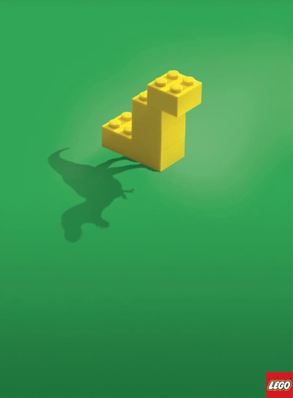
For instance, in LEGO’s ad, they only use two images, a simple lego creation and a shadow of a dinosaur, but you can instantly form a concrete understanding of its core idea — with Legos, you can create anything.
6. Know your market.
You can’t hope to capture your audience’s attention if you don’t know who they are.
Pop Fit is a leggings company that makes apparel for all sizes and body shapes. A good portion of their target audience is women who are rarely represented by models, particularly in the health and wellness space, and have difficulty finding athletic wear. For these women, an ad that shows people who look like them is a show stopper.
7. Leverage hyperbole.
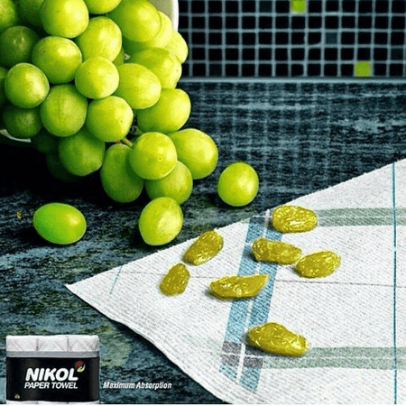
Exaggerating your product’s benefits, in a clever and obvious way, is one of the best methods for slipping some humor into your advertisement, which can capture your audience’s attention and trigger an emotional response from them.
For instance, Nikol’s paper towels obviously can’t turn grapes into raisins, but this ad highlights the product’s absorbent powers in such a clear and artful way, they didn’t need to write a single line of copy.
8. Show, don’t tell.
Showing your audience something is much more engaging and interesting than telling them it. Relying on implication to convey a message is mysterious, making it more fun for your audience to figure out.
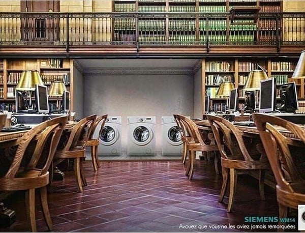
For example, in Siemens’ creative ad, they show the benefits of their product by unexpectedly placing their washers and dryers in a library to show you that they’re so quiet, even a librarian wouldn’t need to shush them.
9. Swap connotations.
In relation to food, the word “hot” has multiple meanings: having a high temperature and being spicy. Heinz brilliantly used the connotation of high temperature to highlight the spiciness of their ketchup, and their creative method of communicating the value of their product helped them instantly attract people’s attention.
10. Be authentic.
Planet Fitness is a brand that has long worked to make fitness less scary and more accessible to people, as evidenced by their “judgment-free zone” policies.
Part of that mission means encouraging people to be themselves. True to form, as many of their facilities open with new sanitizing procedures, they released this video ad announcing their policies. In it, Planet Fitness employees dance with inhibition. This fun and authentic ad supports who Planet Fitness is as a company.
11. Turn your ad into a game.
The brain is wired to predict things. It’s an evolutionary trait that allows us to anticipate what’s going to happen next and quickly react to it. That said, advertisements that are predictable only require a shred of thought to understand, so they’re too easy to grasp and, in turn, too boring to engage anyone.
With this in mind, if you can scrap predictability from your advertisements, you force your audience into a deeper level of thinking to digest your message, compelling them to pay more attention to it.
One of the best ways to ensnare your audience attention and get them to interact with your advertisement is by turning it into a game. By framing your advertisement like a game that can be beat, just like Mazda’s ad, above, your audience has the opportunity to earn an intellectual reward if they spend just the right amount of mental energy playing your brand’s game and grasping your advertisement’s message, which is something most people won’t ever pass up.
1. Canva
Canva is one of the premier free design platforms, available on both desktop and via a robust mobile app.
As an online ad maker, Canva provides a large library of pre-designed templates, 1 million stock images, and drag-and-drop design building. It can also integrate with HubSpot so that you can access Canva directly within the CMS.
2. DesignWizard
DesignWizard is another great option with integration capability. With pre-made templates across multiple sizes and dimensions, you’ll find attractive designs for any need — print and digital. Unlike other online ad makers, Design Wizard also offers free easy resizing so you can quickly create across multiple formats with less hassle.
3. Bannersnack
If you’re creating ads for PPC display campaigns, Bannersnack is a must. Since display ads come in so many shapes and sizes, Bannersnack allows you to create one ad and then generate several more based on the original design but with different dimensions, taking “resizing” features to another level. The only downside is that the free plan limits the number of designs you can create. However, the premium upgrade is reasonably priced.
4. Visme
Step up your social ads game by tapping into Visme’s library of templates for ads and posts for:
- YouTube
Pick from millions of free photos, icons, shapes, and animations to convey what your brand has to say.
5. Snappa
If you’ve ever struggled to remove a background from a brand photo in an expensive photo editor, you’ll be relieved to know that Snappa can do it in one click.
Add this capability to a library of templates, 3 million quality stock photos, 100,000 shapes, and over 200 fonts — you’re on your way to unhampered creativity.
6. Lucidpress
Lucidpress is one of the more versatile platforms on this list, with capabilities ranging from graphic ad design to asset management and direct mail. The free version does limit functionality and the number of designs, though, but Lucidpress’s design environment includes layouts for every type of print and digital use possible from social media ads to flyers and coupons.
7. BannerBoo
BannerBoo is unique in that you can make animated banner ads with their easy-to-use HTML5 ad builder. All ads are responsive, and you can choose from their library of animation effects and transitions. The free plan does contain a watermark, however.
With the inspiration from this list and tools that can help you create amazing ads, there’s nothing stopping you from creating an advertising plan that will help you drive brand awareness and generate revenue for your business.
Editor’s note: This post was originally published in May 2019 and has been updated for comprehensiveness.
![]()
Before your copy can persuade an audience to buy your product, your design must persuade them to buy your copy. In advertising, your design catches your audience’s eye and points their attention to your copy. Then, it’s your copy’s job to hold your audience’s attention.


-9.png?width=328&name=pasted%20image%200%20(1)-9.png)
